
Previous post

Next post


In our second apartment, year two of our marriage, we painted feature walls in the living room, kitchen, dining room, and master bedroom. Our ground floor apartment got little light and had all white walls. Before the feature walls, our living space was both dark and stark. Not a good combination.
My favorite wall was the orange faux finish we did in the dining room. I don’t really like orange, so I don’t know why I ended up going with that color, but it was rich and deep, and made me happy every time I walked past it. I was sad to paint it over with primer when our lease was up at the end of the year and we moved into our first home.
 While I miss my orange feature wall, I could never make myself do anything so bold in this house. Each time I paint a room, it means my kids have to fend for themselves for 24-48 hours, which they don’t mind, but means that laundry, dishes, and cooking aren’t happening. Plus, my energy waxes and wanes, and if I paint it and hate it, I may not have the get-up-and-go to fix it for months.
I don’t know about you, but for me, winters have gotten harder as each year has gone by. My body and mind suffer from the lack of light. Many times when I start getting my energy back in the spring, it is spent working to bring more light to the house to help with the dark next winter. I paint lighter colors on the walls, add timers for my lights (the poor man’s smart bulb), and make new pillow covers and quilts.
During one of these nesting pushes, I painted two walls in the gold living room a shade of cream, thinking it would help bring more light in. I had already painted my dining room blush pink and loved it, and figured this would have the same effect.
 Nope. I hated it. I realized I wanted my living room to be a cave. So I painted it a dark blue, and now it’s amazing.
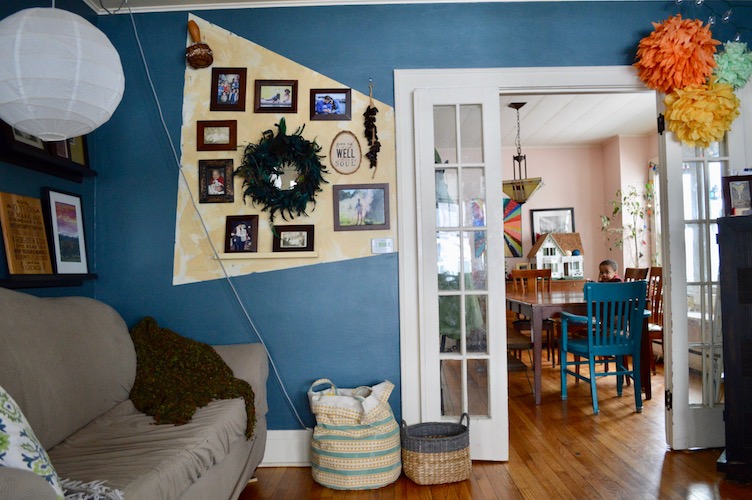
 But the gallery wall that looked great with gold, then cream, paint, disappeared into the dark blue wall. I swapped out some of the prints for lighter ones, but it didn’t help much. So I started considering ways to lighten up the wall right behind the frames without repainting the whole room.
There is a door on that wall that is off-center, and every option I could think of – temporary wallpaper, painting that one wall a different color, would look stupid with the off-center door, or would have competed with the photo gallery.
Usher in the past year. As I mentioned, my marriage became work for the first time this year. Deferring maintenance is no joke. Don’t do it. As we have struggled to get our relationship back where we want it, my husband and I have felt the real stress of spiritual warfare in our lives. The Devil is pissed we figured out what he was doing, and even more pissed that we were able to stop fighting long enough to start working to fix it.
Prayer has helped. Dialogue has helped. But sometimes in the supernatural battle, I felt really alone and was looking to God to show me how he was protecting us when it felt like we were being battered.
As I mulled it over, I imagined my husband and I standing side by side with our arms linked. We were together, but we were vulnerable to attack from all sides. Then I thought about Jesus. Where would he be in that picture? I was drawing stick figures to work this out, and I drew Jesus linking arms with my husband in solidarity and protection. But that still left me almost completely vulnerable, and my husband was still exposed on two sides.
Then my mind’s eye shifted back and up, to an aerial view of the two of us standing there. Instead of Jesus linking arms with my husband, the two of us were encircled in a triangle of three beings linking arms, completely enclosing us. It was the Trinity.
That has been a powerful reminder for us as we continue to work towards peace and reconciliation with each other. I wanted something triangle-shaped in our home as a visual reminder that we are trusting our Triune God to protect us on all sides. I don’t especially like the triangle shape as a design choice, so I decided to make the last corner of the triangle invisible – ending in the opening the door creates on our living room wall. It’s not too obvious, but I know what it means.
I took a page from TOH magazine that I had torn out with an idea for the wall – a painterly, abstract look. After experimenting with the shape, I taped it off.
 Then I went shopping in the basement among my many leftover paint cans from other projects and picked a cream, a yellow, and a gold.
 I poured some cream and yellow out onto a piece of cardboard, and used rectangular scraps of thick cardboard to apply the paint to the wall. I used a paintbrush to touch up, and to get into the areas where the cardboard was too clunky, like the picture shelf and around the thermostat. (Blogging fail: Didn’t remember to take a photo of the wall after the first coat of paint!) The next day, I took my leftover paint from the first coat (covered with plastic wrap to keep it from drying out). I added the gold paint, and did a second coat.
 The instructions in the TOH article say to sand down the wall when you’re finished to get rid of ridges, but I liked the way it looked with drips and lumps, and was afraid I would ruin it if I messed with it, so I skipped that step.
 In some areas, the blue from the wall still shows through, which I like because it connects it back to the rest of the room.
 Have you made any design choices that are meaningful to you – a visual reminder of something?


